
Man walks into an art gallery
A morning at the National Gallery, from first principles

About 550 million years ago a motionless Earth suddenly began to swarm and scuttle with diverse animal life. This event is called the Cambrian explosion. Experts disagree on why it happened, but there is a particularly creative (and basically superseded) theory that purports to explain it: the development of vision. This is called the ‘light switch theory’, and it roughly holds that as atmospheric changes allowed more sunlight to reach the earth, chance mutations caused light-receptor cells to evolve into eyes. In the land of the blind, the anything-eyed animal was king.
An eye, whatever the creationists might say, is the product of an evolutionary process. It is highly adapted to certain tasks that increase the likelihood of survival within a specific context. The first complex eye belonged to a species of animals called trilobites. Trilobites had compound eyes, like insects, and calcite lenses, which means their crystal peepers are preserved in the fossil record. The eye that your eye is descended from also began to evolve in early chordates. It transformed from a light-sensing but non-visual organ into one that could form images—something that could also see.
The evolutionary process by which human vision came about is still mirrored in the pre-natal development of every human eye. A few weeks after conception, the foetus forms optic vesicles in a process that's not too dissimilar from the way a fruit fly develops the precursors to its own eyes. From there it grows a lens, a retina, a cornea, cones and rods, becoming more and more specialised as it turns into the exquisitely complex object that you and I depend on every day.
After birth, the refinement of human vision continues. You learn to focus on objects and differentiate most colours. A bright and blurry world becomes clearer and more subtle. You see fine details more crisply. Your binocular vision and light sensitivity develop. Even in adolescence, you’re still learning to see in more detail, to distinguish between different hues of similar colours, to more accurately differentiate facial expressions and to process visual information with ever greater speed.
As your eye trains itself into a machine for capturing the world, you also imbibe the way that world sees and what it likes seeing. You take in how people look at different objects and how they value them. You learn what different symbols mean: arbitrary marks that you begin to comprehend through context clues and consistent stylisations, and which help you distinguish, for instance, a lower case letter T from a crucifix. Helpless to absorb, you learn who and what the world you live in considers to be worth looking at, and who and what it does not. You learn about physical beauty, which Toni Morrison called one of ‘the most destructive ideas in the history of thought’, and you learn about ugliness, the other barrel of the same gun. You learn how the world sees you, and inevitably you suffer.
And eventually, maybe, you go to an art gallery where all these processes taking place at different speeds during different timeframes over a period of roughly half a billion years are brought to bear on the way you look at a painting.
It is my strong contention that almost no-one starting out finds this an intuitively enjoyable process. Paintings do not move or emit light, and so they don't stimulate the eye in the way that a sparkling mountain brook, a Francis Ford Coppola movie or a grubby laptop screen in a darkened bedroom simply does. One infuriating thing you will have learned by the time you end up in an art gallery is that sight is one of the most basic metaphors we have for understanding. We say ‘I see’ to mean ‘I understand’. When the psalmist wrote, ‘Open thou mine eyes, that I may behold’, he didn’t mean it literally. Nor did almost anyone else in the bible, if you care to look at a concordance, when using the verb ‘to see’. And when you look at paintings, you will strain and strain but for the most part you will not see. This is how it was for me, anyway.
The concepts of looking and seeing are different, and because so deeply coded, they feel different. We ‘look’ for things we’ve lost or can’t see, and we ‘see’ things we can grasp or have understood. When I'm looking at a painting, I feel I’m closer to the chaotic world of sense data that actually exists. This can be a frustrating feeling. When I start seeing, I often feel I understand, but I also know—though sometimes I resent the thought— that this understanding occurs within a politically determined world of metaphor, narrative and meaning. If that sense of really seeing is what most of us are after, it’s also the place where we make most of our moral and intellectual mistakes. It is the reward and the price of the ekphrastic process.
Paintings are hard, and they’re hard to look at because we often feel like we’re looking but we’re not seeing. There are evolutionary reasons for this: the brain can only process a fraction of what the eye can see, and almost any painting is literally too much information. There are cultural reasons: paintings look wilfully strange to those of us who come from a world drenched in photographic imagery and contemporary stylisations. There are sociological reasons for this: I feel threatened and excluded by a place that seems to be intended for people unlike me. There are personal reasons for this: Darren makes a big deal out of liking fine art, but Darren is going out with the girl I fancy, ergo I hate the National Gallery and all who sail in her. Or what have you.
Finally, there are artistic reasons for this. Painters emphasise the content of their paintings in different ways, which can make it harder or easier to see what’s actually ‘happening’ in the painting.
Or to my eyes, they are, anyway. The friction that’s created between mark and meaning, and the quality of emotional heat released when we rub our intelligence against something it finds hard to comprehend, are inherently subjective phenomena, but for whatever reason, these phenomena were what occupied me during the ninety minutes or so that I spent at the National Gallery on Saturday. It’s my belief that our mistakes, our difficulties, our false assumptions and our failures of interest all reveal something about whatever object prompts them (or doesn’t). They’re a worthy, if necessarily subjective topic of critical attention, because they tell us about ourselves and they tell us indirectly about what we’re looking at.
To borrow a distinction, some paintings are much more interested in the signifier, the mark that means, than the signified, which is what the mark represents. If you had to reduce the journey of painting over the last five hundred years to a journey along a single spectrum, it might be the move from stressing what’s signified towards the mark that does the signifying.
That distinction will get me in trouble with serious art lovers. I imagine most would say that a Titian painting is not a painting of something, it is the thing itself. For my own part, I would probably agree with that idea most of the time. But this blog is partially an act of evangelism, partially a record of self-education, so perhaps we can all agree that not knowing that basic what—the individual objects, characters, subject, story and narrative represented—is a huge obstacle to comprehension and enjoyment. Outside of most tight circles, aesthetic appreciation is hovered over by the metaphor of the blind taste test. Would you know the wine was good if someone hadn’t told you? The answer for most of us is no.
So for now at least, fuck the blind taste test. There are connoisseurs who can spot a Titian in a junk shop, and more power to them. But the vast majority of us need to know what we’re looking at before we can see it. Even then we find it hard enough, lord knows.
Here are some of the paintings I looked at, and some of the things I saw, at the National Gallery recently.
Cupid Complaining to Venus, Lucas Cranach the Elder, 1526-7
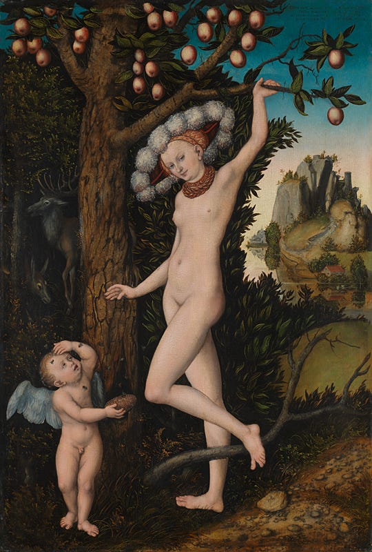
I had noticed the hat, but had I ever really noticed the hat? I’ve never seen anything like it that I can recall. Or the flies. Had I ever really noticed the flies? The painting somehow refuses to occupy a coherent register. The figure comes from a recognisable pictorial world, one that I feel is steeped in a dark misogyny. Here, beneath a strangely leafless tree hung with glassy red apples stands Eve, looking like one of Cranach’s familiar sexy bitches. Her low tummy and small high breasts are hard to reconcile with even a vague notion of what a woman actually looks like. The hyper-real flies on Cupid’s face, meanwhile, have an anachronistic touch of the microscope to them. They seem to have come out of Hooke’s Micrographia.
The painting is introducing many different kinds of landscape into one small place: the figures; the woodland; the foreground tree ingeniously framing the enclosed view of the tiny castle; the stuck-on hind in the left-hand background. I find it hard to take this all in—Eve with her apples, the foliage, the hat—other than in tiny details. It’s as though each part of the painting is conspiring to distract from itself with itself—as though a sufficiently fine set of marks can actually conceal what they so finely represent.
My wife photographs the water, and for the first time I actually notice the water, utterly flat and reflective, in which a minutely brilliant mirror-image of the distant landscape is reflected. Actually, the clearest view of the painting I get is through this second lens. It all seems perfectly clear looking over her shoulder, on a phone screen. I feel most of all that this is an alluring but evasive piece of art. For instance, those aren’t flies, they’re bees. And even after reading the title, I somehow keep mentally referring to the main figure as ‘Eve’, rather than Venus. I mean of course she’s not Eve. Just look at her hat.
Titian, Portrait of a Young Man, 1515-1520

I don’t look at this for long; in fact I hardly look at it all. For the first time in all my time of gallery-going I really see it straight off. (I sometimes hear people say "it goes straight in" about experiences like this, and I know what they mean). It's not just the pathos of that Adam’s apple, the receptive intensity of the man’s expression, the first signs of age beginning to worry at the cheek, the eye-sockets, the edges of the mouth and the skin on the neck. It’s also a quality that other Titian portraits have, which is a more realistic sense of the surrounding darkness. Titian was brilliant at capturing the way light looks in darkness (see also: his unphotographable masterpiece the Martyrdom of St Lawrence, in the Venetian church of the Gesuiti, which dos something similar for outdoor nocturnal light). I’m not sure I believe the darkness of a Veronese or Tintoretto portrait as anything other than an abstract background. Here I get a faint sense of interiority, of room space. It grounds the portrait in an undisclosed reality. And of course, he has a beautiful face, and wonderful hair whose light fall across his temple is traced with extraordinary verisimilitude
.
Juan de Zurbarán, Still Life With Lemons in a Wicker Basket, 1643-1649

It seems like a short cut, a short-circuit cheat, a disowning of convention, a fix-up traced from a camera obscura or daguerreotype. It is as quick and effective as a photograph, an instant picture that, if you stay, reveals itself slowly as an immense act of contemplation.
Giovanni Battista Tiepolo, An Allegory with Venus and Time, 1754-58.

I can’t say how many times I've walked past this painting without looking at it properly. The Tiepolo room is a crossing place in the gallery, somewhere you have to pass through to get to the impressionists. It’s dark and a little cramped and it doesn’t help that Tiepolo often makes you feel that he isn’t paying attention to what he’s painting. He feels, at a glance, like a stylist par-excellence, but not an intellectual painter. The babies are dimpled, the clouds beneath the figures unfurl with the untroubled obviousness of a deus ex machina. There are a lot of nipples in old master paintings, but I'm not sure I've seen a pair that feel more like a shorthand for the idea of nipples than the two on Venus here. Isn’t this all too easy, too light, too at ease with its own artifice, its presumptions of the beautiful?
Yet the more you look at Tiepolo, the more he begins to feel like an intensely thoughtful formalist. Roberto Calasso, in the central section of his book Tiepolo Pink, makes an extremely compelling case for Tiepolo—or what you might call the Tiepolo function, since he often had lots of assistants—as a painter capable of creating occult, self-referential symbolic worlds. I know of someone who calls Calasso ‘the last true great fraud’, but that’s by the by. It’s Tiepolo we’re interested in, and the more I looked at this panel, the more I felt him as an artist of profound structural calculation.
From its extravagant shape and size, you can see it was originally a ceiling panel, designed to be viewed from far below. Its carefully spaced groups invite you to read it in narrative terms, almost like a comic book panel. Start at the top and go down in a zig-zag, left, right, left, right. We start with high immortal blue, that deep Italian sky that here has that extra depth of late afternoon, but not dusk. Below are two doves, communing wordlessly in a mating dance of beaky kisses. Move down and right to find the three half-shadowed graces, then down again through Venus. Venus represents a lot of what one might object to in this painting. She is a cliché of considerable power: imperious, untouchable, a cruel mistress. You might reply that ‘a cliché with artistic force’ is a rather rococo species of oxymoron. I agree. Tiepolo is another of the same genus.
But Time! Time is early-90s metal: Enter Sandman or Cowboys from Hell. Time is generic decadence. He has laid down his scythe to accept the child from Venus, bringing the new-born—the commissioner’s heir, perhaps?—into our world. Time, more than Venus, seems to know what this means. He is demur. In my reading, he is abashed his own involvement in accepting a child into the world, rather than by Her Pointedly Nubile Eminence. The painting’s focal point is not the child, but the look exchanged between Time and Venus. The exact centre of the canvas lies along this coefficient.
There is a fourth figure in the group. Cupid is cast mostly in shadow between Time and Venus. Though we might expect him to belong to Venus’ world, he is painted as Time’s child. (It is the new born, not Cupid, who bears the traces of Venus’ pitiless pearlescence.) His thighs are mottled like Time’s slack muscles. Tiepolo’s pallet restrains itself to the tone-world established for the larger figure: dun and shadowed flesh, with red and blue velvet on the trimmings. And of course, like Time, Cupid has wings with feathered rows. Like Time, he carries a kind of weapon. With every brushstroke that makes up Cupid, Tiepolo the painter is working to contradict the mythological background of his allegory. Whether he briefed assistants for this passage or completed it himself is impossible to say for sure, but I cannot imagine just some assistant applying the two outrageous brushstrokes that conjure the infant cupid’s testicles.
Those testicles are the painting’s sole touch of bawdiness. Some other passages approach it: the rote titillation of the three graces; the skew whiff apprehension messing up the new-born’s face. The odd pathos of time’s heel—could it even be dirty?—as it emerges from the beanbag clouds. As the graces point down to Venus, and Venus hands off to Time, the infant’s white legs point us towards Cupid: towards the time-bounded world of the bawdy and frank the new-born will enter. And what will he do there? What bawds from grand houses all must: he will make another baby, and begin what the poet Michael Longley once called ‘the slow descent / Of the scrotum towards death.’
Look at the painting again, and see that clear comic-strip of a zig-zag leading you down. Tiepolo’s challenge seems, in my view at least, to have been about establishing a set of relationships at his painting’s centre that can be cyclical and self-sustaining—and to do this without disrupting the painting’s main structural and allegorical contention, which is that we are all going the same way: down and down. The lowest section of the canvas is black.
Crivelli’s Garden, Paula Rego, 1991

Can one speak of forceful gentleness? This huge, humane, softly playful picture was painted by Paula Rego thirty years ago to hang in the Sainsbury Wing Dining room. Taking National Gallery staff as her models, Rego created a playful refectory piece whose radiant sympathy floods the room and steals the thunder from Crivelli’s altarpiece, hanging opposite. There is lots to see in this painting: stories within decorative schemes within other stories. Paintings from the national gallery and other collections are sketched on the painted columns, while other iconographic figures are being painted in by figures in the painting. A renaissance lion looks out at us in statuesque tones, but is playfully paired off with an inky cat on the left hand side of the picture. It’s rare for a painting so full of reference (and self-reference) to feel so inviting, but I found myself absorbed by the profusion of narratives and visual games. I particularly liked the moments where characters within the painting are helping to construct it, which I read as a way of further highlighting the importance of the people who work in these galleries, and saying, a little more softly perhaps, that we all play a part in making the art we see.